It’s Possible I’m In A Paint Rut. Do They Have Therapists For That?
So I’ve been really lazy picking paint colors in this house.
Well. It’s not that I’ve been lazy. It’s just that what works, works, and nobody ever got famous from re-inventing the wheel.
(Actually, now that I think about it, no one ever got famous for inventing the wheel the first time, which is a shame, because that one was kind of a big deal.)
So basically, I’ve been stealing colors from our old house to use in this one. It started with our bedroom. I knew I wanted it to be a neutral gray (being married to an active-duty military member, the thought of re-sale is always in the back — okay the front — of my mind, which means everything has to stay fairly neutral). After hanging samples on the wall and staring at them for several weeks, I went with Valspar’s Urban Sunrise:
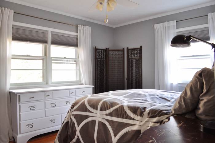
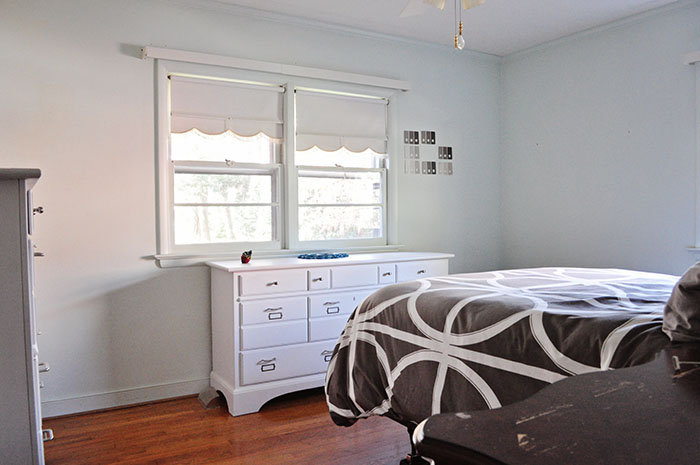
Still needs some work, but I think we can agree it’s an improvement on the mint:
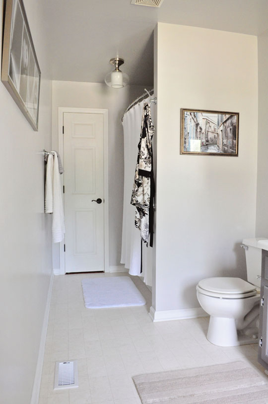
It turns out this gray is very similar (although slightly more bluish) than the Valspar Filtered Shade I had in our old master bathroom. In retrospect, I actually wish I’d gone with that:
Then, several weeks ago, I discovered an almost-full can of our old master bedroom color in our paint cabinet, Valspar’s Rugged Suede:
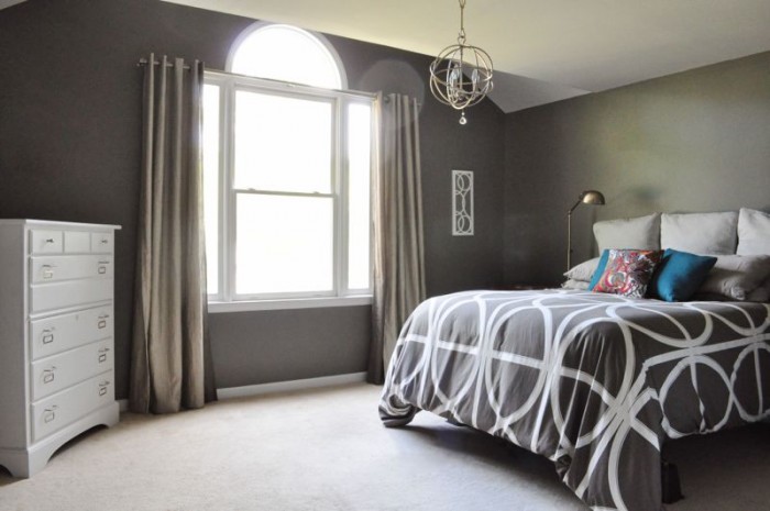
Obviously a bolder choice, it really worked in that room because of the large size and all of the natural light. But since we’re trying to save a bit of dough, I decided to slap it up on the walls in our current master bathroom:
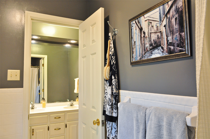
It’s a little dark for such a small, poorly lit space, but there’s enough stark white tile to counterbalance the charcoal, and hey. It was free. (And yes, I had to stand inside the shower to get that shot.) I still need to paint the trim, frame out the mirror, and deal with the mixed metals we have happening in there, but I think it puts the pink and mint floral wallpaper to shame:
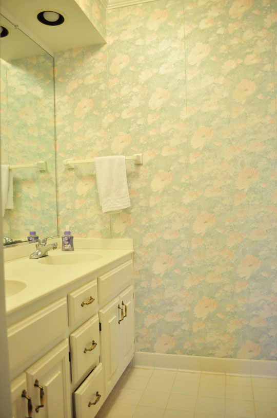
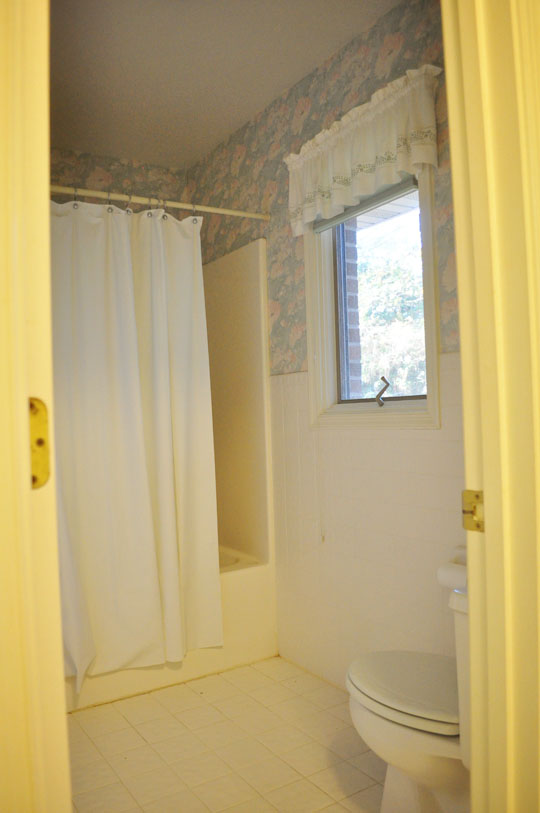
Not that pink and floral wallpaper needed further shaming.
And it’s not like I didn’t try to pick at least one new color. I did. I picked a color for the kitchen, painted it, and then promptly hated it.
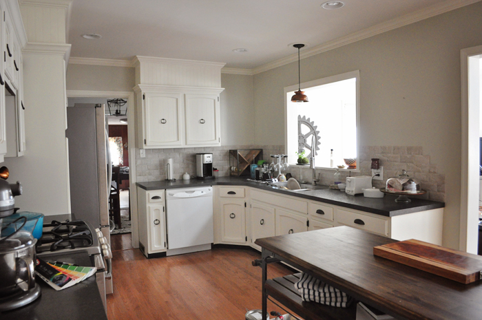
For some reason I’d picked what I thought was a neutral with some green undertones. Which it was. The problem is that a neutral with green undertones is actually quite similar to light mint, which is the color of the walls and the trim throughout most of this house THAT I’VE BEEN TRYING TO GET RID OF.
Apparently this house is so inundated that the mint worked its way into my subconscious via osmosis while I slept and used its superpowers to coerce me into buying an actual can of the stuff and paint my kitchen with it. And actually, since Justin bought the can, he accidentally bought it in a semi-gloss sheen, which is a huge no-no for walls. Especially imperfect drywall. Shiny paint might be easier to clean, but it accentuates imperfections. You can’t tell in the photos, but my kitchen was like an oily, acne-riddled teenager after I painted it.
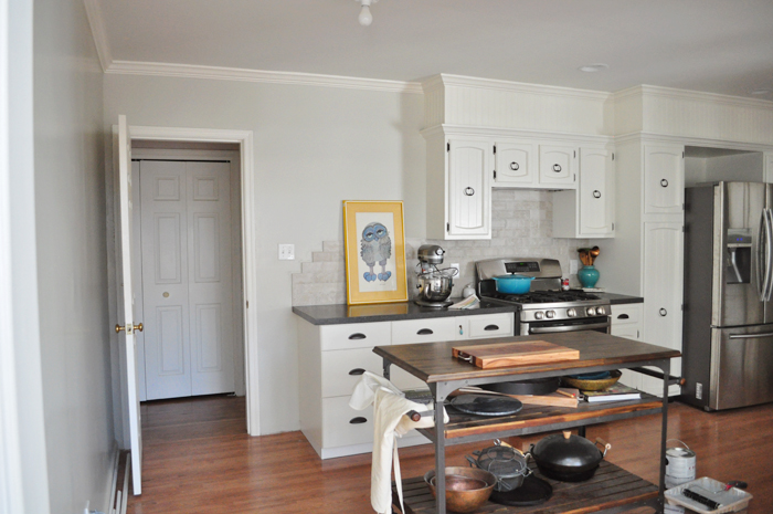
And every single ripple and divot across the contours of its face was highlighted. It was worse at night when the lights were on. So the day before some friends came to visit, I bought a gallon of my favorite neutral from our old house, Glidden’s Sand Beige, in an eggshell sheen and slapped it up without testing any samples:
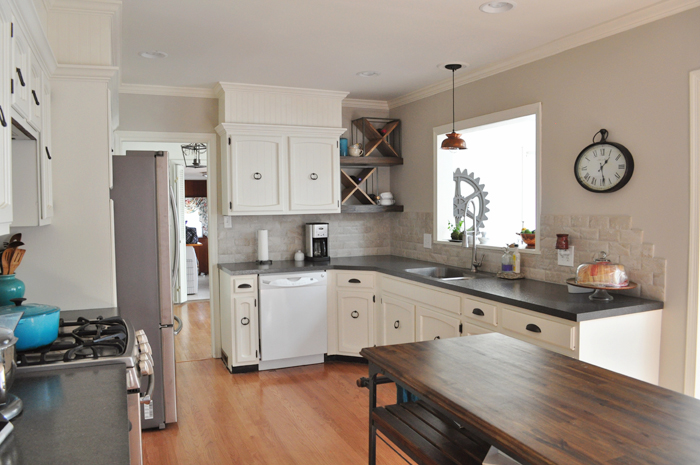
And, sure enough, the difference is subtle but much better:
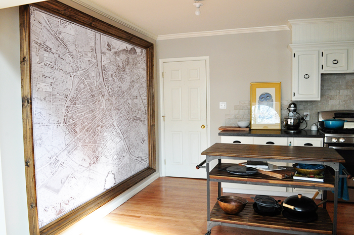
To my unedumucated eye, Glidden’s Sand Beige is the perfect neutral:
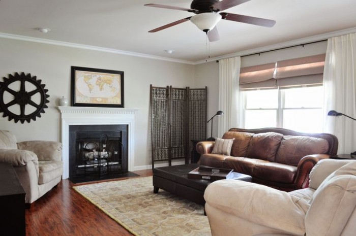
Sand Beige in our old living room.
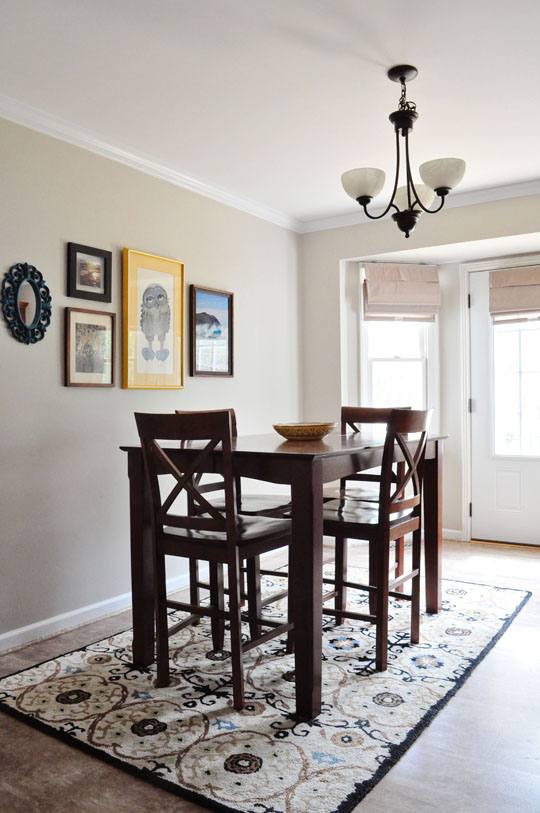
Sand Beige in our old kitchen.
Then, while searching Houzz for inspiration photos for colors for our sun room, I ran across this and was immediately drawn to the color:
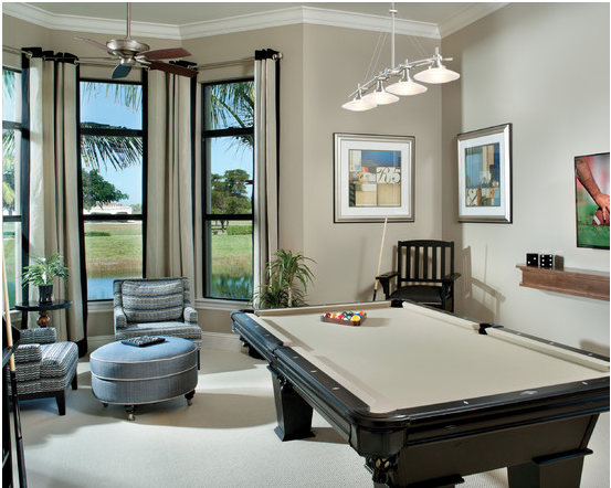
But when I looked it up, I realized it’s the same exact color we had in our old guest bedroom (Sherwin Williams Taupe Tone):
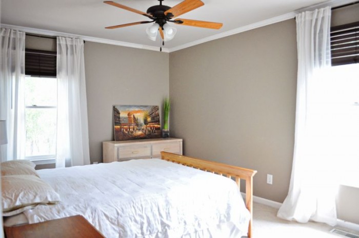
Is it just me, or is taupe like the worn leather jacket of wall colors? It soothes me.
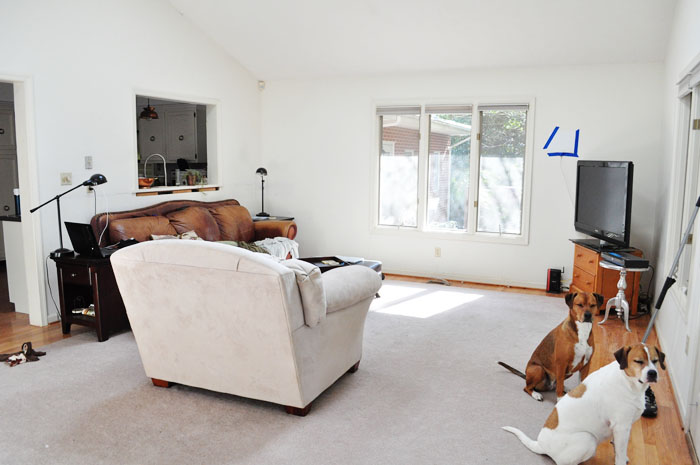
Our current sun room (actually, we’ve made some furniture changes in here that I still need to show you):
Even more coincidentally, while I was sifting through my Glidden fan deck in search of a neutral that would look nice for our dining room and living room, I was immediately drawn to one I thought looked good with the kitchen’s Sand Beige, and it turned out to be Fossil Gray — the same color we’d used in my old office:
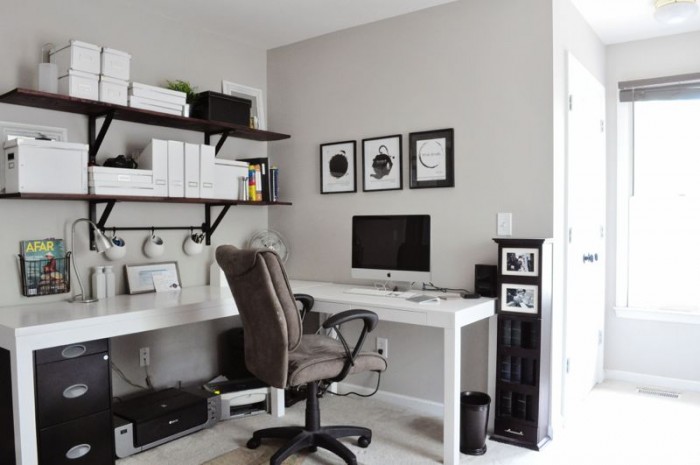
So I don’t know. It’s quite possible I might pull the ultimate lazy and just re-use these old gems. While I realize with the bajillions of colors out there, that seems a little redundant, but picking paint is hard, guys.
Do you have any favorite neutral paint colors you think I should try?

Comments
Omg until other people vote, everyone will know I went for the sandwich.
I can see the difference between these paint colours but I definitely don’t feel as strongly about them as you do…except maybe that green one. Don’t do that ever again ok. Haha. I like what you replaced it with.
Hahaha it’s quite possible that NO ONE ELSE will vote because people would rather see cool map frames or posts about Italy. I can dig. And thanks for the green paint validation — that’s the one I was worried no one would see a difference with! :)
Who am I to judge? We bought five gallons of what turned out to be mint green, and hated it the minute it went on the walls. We aren’t smart enough to keep the paint chips that we like, so we try to re-select the colors that we liked, with mixed success. Even when we try to get something totally different, we end up with something almost exactly the same (I.e., Sherwin Williams Aleutian is almost the same as Bleached Denim, either Valspar or Glidden – can’t remember which). Anyway, I love the dark color in the bathroom, saw nothing wrong with the green you had in the kitchen, but also like the change. For your sunroom, I recommend Sea Salt (Sherwin Williams). We put it in our living room, and it totally changes with the light, looking gray, bluish, sometimes almost white, and I think it would go well with your kitchen, furniture and dogs. PS – have I ever told you that someone in my family has your owl? Either my mom or sister, but I know I’ve seen it hanging somewhere!
Ha, I feel your pain! I did not do a good job of capturing the green in the kitchen. Worse than the color was the shine, which was really obvious at night. It made the drywall look awful. I will check out Sea Salt — it might work for the living room as well. Thanks for the suggestion!
That is CRAZY about the owl. I found that girl at a thrift store and fell in love. I wouldn’t mind getting a wood stained frame for him, though. But I do like the yellow mat. That artist did several different owls I think! I find that whenever I’m overreacting about something, all I need to do is look at her and she sets me straight. Her face just says, “Whatever dude. It’s nbd.” ;)
Not much use to you, I’m afraid. Had neutrals at my last place and at all the many rentals before it, and they made me dream of colour. So I’m just not a neutral girl when it comes to paint. (I know it’s all very classy though.) I lean toward very pale bluey-greys, darkish purpley-greys, and pale french yellows.
That palette sounds very relaxing!
I dig it.
I love neutrals on the wall because then you can get totally crazy on accents!
So true! I hope to be a little bolder with my accents this time around.
OH KATIEEEEEEEE!! I’m back on the internets! First, I freaking love those neutrals. My plan in our next crib is to have just slightly different coordinating neutrals throughout the whole house. I was too bold for that in our current house, but its so nice too if you want to change up decorating often – as I do. But, I’ve had my eye on charcoal for awhile, its so PURDY!
The internet has missed you immensely! It just hasn’t been the same.
I LOVED the charcoal in our old bedroom because the room had so much natural light. It’s fine in our bathroom, but as a photographer you know — it definitely works better where there’s more light!